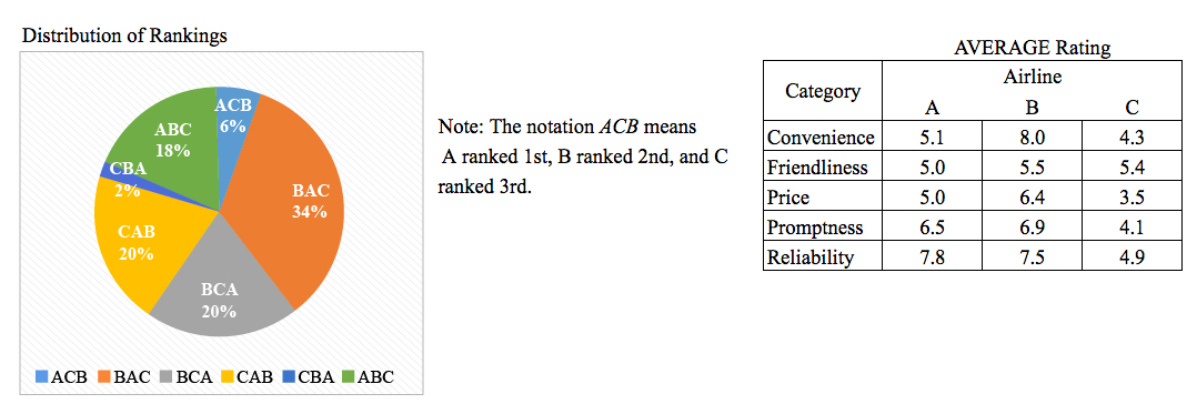
The sum of the five average ratings was calculated for each of the three airlines. The airline with the least sum was ranked $1\s\t$ by what fraction of the travel agents?
So, you were trying to be a good test taker and practice for the GRE with PowerPrep online. Buuuut then you had some questions about the quant section—specifically question 14 of Section 4 of Practice Test 1. Those questions testing our knowledge of Graphical Methods for Describing Data can be kind of tricky, but never fear, PrepScholar has got your back!
Survey the Question
Let’s search the problem for clues as to what it will be testing, as this will help shift our minds to think about what type of math knowledge we’ll use to solve this question. Pay attention to any words that sound math-specific and anything special about what the numbers look like, and mark them on our paper.
We have both a pie graph and a table containing numerical data, so this question likely tests what we know about Graphical Methods for Describing Data. Let’s keep what we’ve learned about this skill at the tip of our minds as we approach this question.
What Do We Know?
Let’s carefully read through the question and make a list of the things that we know.
- We want to identify which airline had the least sum of its five average ratings
- For this airline, we want to calculate the fraction of travel agents who ranked it first
Develop a Plan
Wow! Definitely a lot going on in this question. Let’s first look at what information we can gather from the pie chart and the table. Then we’ll decide how we can use them to answer the question.
Pie charts are useful ways to display percentages or proportions of a whole. Visually, we can easily see which parts of the pie are largest. However, the problem does ask for a numerical proportion at the end, so we’ll want to use the percentages represented in the pie chart when doing calculations. This pie chart in particular gives us a note where they describe in detail what the pie chart represents. For example, the $ACB$ part of the pie chart tells us that $6$ percent of the travel agents ranked $A$ first, $C$ second, and $B$ third in terms of preference.
The table appears to give ratings in five separate categories for each of the three airlines. Seems straightforward enough. Now that we’ve looked at the graphical displays of the data, let’s analyze the question to figure out what we’re looking for.
The question tells us that “the sum of the five average ratings was calculated for each of the three airlines. The airline with the least sum was…” near the end of the question. From this, we can see that we need to identify the airline that has the least sum of the five ratings given in the table. While we could whip out our GRE calculator and compute the exact sum, that would be time-consuming. We also know that we don’t need the exact sum, as we only need to identify which airline had the least sum. For this reason, it makes more sense to try our hand at estimations.
Once we identify the airline with the least sum, we can then use the pie chart to find the proportion of travel agents that ranked it first.
Solve the Question
For estimating using the table, let’s first start by looking at the first integer for each value. The goal here is to see if the values are so different that we don’t need to sum them up to do a more exact comparison. If we get values that are too close together, then we should definitely calculate the estimate of the sum. As a last resort, we can break out our calculators. Looking at the first integers for each value, we see:
$$\table A, B, C;5, 8, 4;5, 5, 5;5, 6, 3; 6, 6, 4; 7, 7, 4$$
Looking at these numbers, Airline $C$ definitely appears to have the least sum. For each of the five rows, it has either the smallest number, or is tied for having the smallest number. Also, the last three rows clearly show that airlines $A$ and $B$ have higher values than airline $C$. So airline $C$ has the least sum. The question is clearly designed to encourage estimations instead of a direct calculation here. If the numbers were much closer together, then we would likely want to use our calculator to estimate the sums. Here, the test designers appear to have purposefully placed the values for airline $C$ so much lower than the other values so that we don’t need to do an exact calculation here.
Now that we’ve identified that Airline $C$ has the least sum of the five average ratings, we need to determine the proportion of travel agents identifying $C$ as the best airline. From the pie chart, we can see that there are two options that identify $C$ as having the highest ranking: $CAB$ and $CBA$. Adding their percentages together we get:
$$CAB+CBA = 20%+2%=22%$$
We want the proportion, not the percentage though. We can convert from a percentage to a proportion by dividing by the whole amount, which is $100%$.
$${22%}/{100%}=22/100$$
The correct answer is $22/100.
Though not required, we could also reduce this fraction further, since we know that both the numerator and denominator are divisible by $2$ since they are both even numbers.
$$22/100={11·2}/{50·2}=11/50$$
What Did We Learn
Estimations can be much better for us than exact calculations. We definitely saved a lot of time in this question by looking at the first number in each value in the table, showing us that airline $C$ had much lower values than the other two airlines.
If we don’t need to perform an exact calculation, let’s save time by avoiding it!
Want more expert GRE prep? Sign up for the five-day free trial of our PrepScholar GRE Online Prep Program to access your personalized study plan with 90 interactive lessons and over 1600 GRE questions.
Have questions? Leave a comment or send us an email at [email protected].